Approach Perfection Ltd
The Story Behind Our Brand
Approach Perfection is an invitation: Step closer to perfection.
However, we are not referring to the superficial, aesthetic perfection seen in magazines, but rather to perfection as a feeling—that deep state of well-being, peace, and inner fulfillment.
Our concept and logo were born from a genuine desire to offer you far more than just standard aesthetic treatments. They represent our intention to bring you as close as possible to your ideal moment of relaxation.
At the center of our logo sits a serene female figure. She represents your face and body, entirely relaxed in our hands.
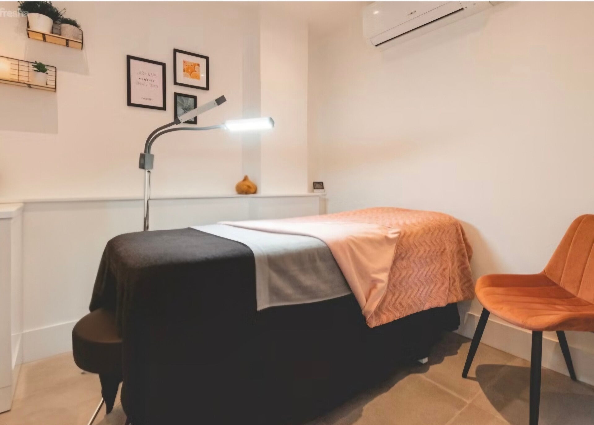
We created this space as a sanctuary where your mind and body can completely unwind—a place where you lose track of time, and where stress and daily worries simply melt away.
The warm background, bathed in shades of yellow and orange, symbolizes light, positive energy, clarity, and renewal. Just as a sunny day instantly lifts our spirits, our wish is that every single minute spent enjoying our treatments recharges you with energy, vitality, and a radiant glow.